Sunday 30 June 2013

Thorndon Hall Letter Rack, Notebook, and Pen Pot inspired by Carol Quance

Over on the Paper Artsy blog this week, Darcy has been back with the most amazingly creative and imaginative projects you have ever seen in your life! She has made washi tape on wooden spools with its own storage made from scratch, which you can see here, an apron, and the most amazing stuffed cat which just blew me away. I had intended to make the apron and spent hours looking for the one I know I have tucked away in my craft room, but to no avail. So I am very sorry Darcy, and Paper Artsy, to be so feeble - it will probably turn up and I will make it soon. Unless it got stolen by Gillian, in which case I may never find it!!  I hope you will go over and look at the projects Darcy has made. What a mind!

So I do hope it is ok, but this week I am entering the challenge using Thorndon Hall papers and Fresco Paint, based on last week's guest artist, Carol Quance, who is one of my favourite people ever. I was so pleased her projects meant that I ordered these papers as they are gorgeous and I know they will go a long way. For this project it was fun to build up layers of stamping on top of the papers, rather than what I would usually do for anything Paper Artsy-style, of stamping on layers of Fresco. I wanted to make something really useful, a letter rack and pen pot to go on the living room windowsill next to my laptop so I don't have a pile of clutter next to me constantly - Colin calls it my nest.


I painted the letter rack edges with Fresco Finish in Pansy and then cut all the pieces of the Thorndon Hall paper. I stamped a huge selection of stamps in co-ordinating shades of Archival inks. I wanted to stick the pieces down with gel medium so I thought I would use Archival rather than distress, although I edged the pieces with Vintage Photo. The stamps I used were the Keyhole Clock, Letters Mini 8, Numbers, Letters Plate 5 (the diamonds and All the things wording), Travel Plate 4 (Postmarks), LP014 (Script and Lady with Tea Cup), and Clocks 5 (The time of my life, Hours Minutes, Tape Measure). I also did some stamping with Fresco Snowflake.


This is the back of the letter rack. I love that particular piece of Thorndon Hall paper with the flowers on!


The penpot has been painted with Pansy Fresco and then pieces of the Thorndon Hall paper cut and stamped as for the letter rack. I used little pieces for the inside dividers to finish it off inside.


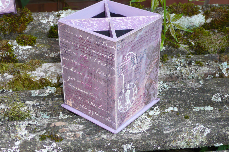
I love the pens on this piece of the Thorndon Hall paper as they go with the pen holder! The clock is stamped in Snowflake Fresco.


The notebook was an after-thought late last night when I was popping it into the letter rack. It's the one I've been using for a while so it's already dogeared but I thought I would use some scraps to match it to the set. I stamped the background in the same way as for the other items. I stamped the Tea Cup hat lady from LP 014 but carefully cut away the tea cup and added a shrink plastic pediment as in Carol's projects last week, gold embossed and stamped with the script mini Mini 26. The image has been coloured with Distress Inks and I cut a frame with a memory box die kindly lent by Petra. Thank you, Petra!


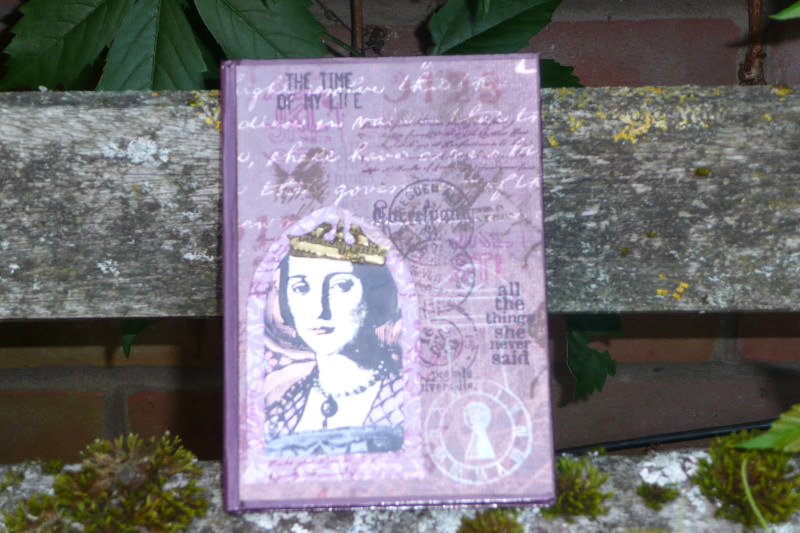
A close up of the lady with her new hat!


The set on my garden bench.


I have started to have a little play with the washi tape Darcy showed us. I have made washi tape before using Superdrug microporous tape - don't know where I put it! But I haven't tried it with Fresco paints which really intrigued me. There was some really old Sainsburys tape in the medicine cupboard. Hope no Paper Artsy folks need bandaging any time soon! I used Mocha Mousse, Lilac, Claret, and Rose, and I'm sure these colours will work well with the papers:-


And I've stamped with Archival inks using some of the stamps used on the main project but it's coming up to the deadline now so I will have to return to this another time!

Friday 28 June 2013

Sun, Sea, and Beach Challenge for Crafty Individuals - Flip Flop Papier Mache Box


 Over on the Crafty Individuals' blog you have just enough time to make your entry for the June challenge, which is Sun, Sea, and Beach. All the details are here but basically just use one Crafty Individuals' item in your make, and incorporate the theme, and just for entering you will be able to claim 25% off anything you buy from the shop, anhd you will be in with a chance of winning a wonderful prize! You have until the end of the day on 30 June to enter. For my bit of inspiration I have decorated a papier mache box in the shape of a flip flop, to keep those beach-combing trinkets in (you know, the things we used to give to Mum to put in her handbag!).


I painted it with Fresco Finish paints in shades of orange and yellow and used images from 272, which are the shells and text, and 278 which are the beach huts and the parasol girl, and 034 which is the round text stamp. I painted my images with the Frescos, incorporating shades of blue with the orange and white. I finished off with some pearls on the thong that would go between the toes.

Do hope you will join in!


Sunday 23 June 2013

Lynne Perella Canvas Inspired by Carol Quance


Phew, I made it! A combination of going to bed late and getting up early! I adored the canvas Carol Quance made, which you can see here, and I have used very similar elements. I used an 8 x 8 canvas as I didn't have a 6 x 6 box canvas and I wanted deep sides. I used similar colours to Carol although mine looks quite pink in the photo and is actually more orange IRL. I used some Zesty Zing in the centre as that is where my main image was going to be and I thought it would highlight it. I used copper Inka Gold over the stencilling but would love to get some more Treasure Gold as I am quite hooked now!


I coloured the Lynne Perella image from LP 01 with Distress Inks as for the card yesterday and added a shrink plastic pediment, this time stamped with the script mini Mini 26. I didn't have a die for the wings as Carol had, so I used some chipboard wings which I triple embossed in gold and then stamped into the molton ep with the script stamp and then highlighted with Treasure Gold in Ice Fire. I made a shrink plastic version of the same main image using Inktense pencils to colour.

As I had a larger canvas I wanted to fill in the edges so I went over the whole canvas and the sides with the script mini, and the small script from LPC014 in various shades of ink to match the paint colours used to create depth, and then used the small script in black and in Snowflake. I tried using Picket Fence Distress Paint but this didn't work well so I had to go over it again with the Fresco - Yay for Frescos!

For the sides I did the same as Carol and used the harlequin stencil with the grunge paste, and then the Crowns from LPC014.


Here's another photo with a bit less glare on the main image.


I am entering this into the Paper Artsy challenge, inspired by Carol Quance's canvas.

Saturday 22 June 2013

Carol Quance Inspired Lynne Perella Card


This week on the Paper Artsy blog they have one of my favourite designers as guest, Carol Quance. Carol has made a tag book, showcasing different techniques and using Thorndon Hall papers, and a stunning canvas. I am still hoping to get the canvas done in time if I either stay up late or get up early, but I have used elements of both for my card as I thought it would be useful to have a few more cards in my stash.

I loved the Thorndon Hall papers so I went ahead and ordered some and used two of the designs on my card, together with a Lynne Perella image which I coloured with Distress Inks. I used the harlequin stencil with grunge paste which Carol used on her canvas, with some Ice Fire. I added a feature Carol used which I couldn't wait to try - using the Tim Holtz pediment die on shrink plastic! I shrank it with gold embossing powder and stamped the Script mini into it when it was molton, and used the same stamp over the backing paper in two shades of mauve.


I edged the paper with the Tim Holtz distresser and folded back one corner so you could see the other side, and popped a bit of text behind it. I cut a Gothic arch die (thanks Petra!) from another sheet of Thorndon Hall to pop behind the main image which offset it well - how often does Petra come to my rescue, have you noticed?! Then I popped the whole lot on a Kraft card blank.

I am entering this into this week's Paper Artsy challenge.

Thursday 20 June 2013

Indigo Blu Elizabeth Bennett Wooden Hanging


I've made this wooden wall hanging using Indigo Blu stamps and Fresco Finish paints. The current Indigo Blu challenge is Backgrounds Galore, so I concentrated on the base of the hanging with lots of different paint colours, two different stencils with Grunge Paste, and the Indigo Blu Script stamp in different shades of ink to tone with the paint colours used. I highlighted the stencilling with Ice Fire Treasure Gold. I added the 'Pride and Prejudice' and the 'So Beautiful' wording from the Mr Darcy set.


I stamped the main image of Elizabeth Bennett which I painted with Fresco Finish paints and then painted a piece of card with Zesty Zing yellow paint and stamped just the flowers, which was a bit fiddly, and cut them out and added a little Smoked Paprika to the centres. To finish off I dotted some glue around the plaque and sprinkled with some tiny shimmery beads.

Wednesday 19 June 2013

The Adventures of Huckleberry Finn


Over on the Happy Daze blog I have made a simple card using the Huck Finn stamps by the Artistic Outpost. It is quite a large card, 8 ins x 8 ins and I stamped a selection of the text stamps around the edge in different shades of blue, with the main Huck Finn image in the darkest blue in the centre. I thought it was quite a nostalgic subject for a card!

I am entering this into the Artistic Outpost Referral Programme for June. You can buy their stamps from them if you are in the US, and from Happy Daze if you are in the UK.

Saturday 15 June 2013

Canvas Inspired by France Papillon for Paper Artsy


Over on the Paper Artsy blog, France Papillon has returned as Guest Designer this week with some great projects! I was particularly inspired to join in the challenge this week by this particular make, where she suggested brayering Grunge Paste onto a canvas - the texture is amazing and I dashed into my craft room to try it. It is definitely something I will do again on other surfaces. I like the way when you add your Frescos over the top, the striated surface visually blends the colours.


I have taken several elements of France's project, the bottles, the bookplate, the keyhole, the background and colours, and the heart. I painted my background with Green Olives, Hey Pesto, Guacamole, Limelight, Toad Hall, and then a few streaks of Metallic Glaze. I dry brushed the edges with French Roast to frame it. I also stamped with the script from LP 014 in Coffee Archival which added a bit more texture.  I applied grungepaste to the die cut bookplate and applied the green paints and the French Roast and a little Ice Fire Treasure Gold (well, I've got some now!). For the inside of the bookplate I stamped the woman from LP 014 and painted her with Vintage Lace and Pumpkin. I added jump rings and a piece of chain.

I made the key hole out of clay and painted it with Beach Hut and a touch of Pumpkin and some more Ice Fire.


For the flower I used some tissue paper which I stamped with the two different sizes of 'flower' with the man/clock design from Hot Picks HP 1004 using Pumpkin and a little Autumn Fire and made them into a flower and added a little Spiced Marmelade DI around the edges. I added some pieces of pearl trim and a metal leaf. I had some fabric leaves too which I stamped in Coffee Archival with the leaves from HP 1004 and the script from LP 014


I stamped the bottles Mini MN 63 twice in Coffee Archival and painted them with Green Olives and Hey Pesto, with shading with French Roast. I cut them out and covered them liberally with Crackle Glaze and zapped them with the heat gun to give a cracked and bubbly glass effect. I finished off with a little heart made from a mould, to match the key hole.

Wednesday 12 June 2013

Gelli Print Think and Wonder Card


Over on the Happy Daze blog I have made a card using a Gelli print background and Artistic Outpost stamps from Think and Wonder, Flower Market, and Whimsical Melange.

This was my first time with the Gelli plate, in fact I booked the Andy Skinner class not even quite sure what one was. He was a great tutor and I was pleased to come away with plenty of background pages to use on projects in the current months, although many of the ones I made were no good at all! I tended to like the secondary impressions best which seemed to have almost a canvas texture look to them. This is the one I have used with the background stamping added but before I added the collaged pieces:-


I enjoyed the messyness of this technique. Wouldn't it be a fun thing to do in the garden in the summer with children and friends?

To finish the card, I stamped the butterflies on a couple of other pieces of Gelli background, one in lilac and one in turquoise and cut them out, and stamped the house frame from the Whimsical Melange set onto the tutquoise piece, to frame the little girl.

I am entering this into the June Referral Programme for the Artistic Outpost. You can buy their stamps from them if you are in the US, and from Happy Daze if you are in the UK.

Tuesday 11 June 2013

Golden Age of Ballooning Altered Shower Gel Bottle

 
Over on the Happy Daze Blog I have altered a shower gel bottle using Artistic Outpost stamps. I used French Flight and Paris Exposition.


I used Glossy Accents and tiny green beads on the top.


I'm entering this into the June Referral Programme at the Artistic Outpost. You can buy their stamps directly from them if you are in the US, or from Happy Daze if you are in the UK.


Sunday 9 June 2013

Wooden Sewing Box - Inspired by Sue Carrington for Paper Artsy


I'm joining in the Paper Artsy challenge at the 11th hour this week. It's been a difficult week for a number of reasons, and my blogging is completely behind and out of synch as my internet (and landline) has been down for a couple of days. In my week of ups and downs though, I have as always enjoyed the Paper Artsy blog, and I love the work of Sue Carrington who is this week's guest artist, so thank you for giving us so much pleasure. I must apologize for uploading something that I may well go back and tweak a little, and I hope that isn't bad form, but I didn't want to miss the deadline and I have had lots of mishaps with this project along the way.


The box was wooden with silver hinges so I painted it with Snowflake Fresco Finish and then coloured the hardware with an alcohol pen which gave a dark bronze colour which I then knocked back with Treasure Gold in Ice Fire, which is a brand new purchase for me, and buffed it up. I covered all the inner sections and back and front of the box with Tim Holtz paper which I gessoed so that my stamping would show up more. I then basically stamped with millions and trillions of Paper Artsy stamps, I would challenge even Mrs PA herself to spot every one of them! My plan was to use neutral colours, starting with the palest first, with abstract stamps, and then build up to my sewing related focal images in the stronger colours, to give a very layered effect. Thank you so much to Petra who came round on Thursday evening with her sewing stamps. You see, it wasn't an entirely bad week! At this point the box was going a bit Pete Tong, mainly because I couldn't decide how it was oriented, and Petra pointed out that if it was laid flat on a desk and you were working from it, the sectioned part would be the base and the plain section would be facing you and would be the lid. But when you are carrying the box like a suitcase, the orientation of the stamping needs to be a different way up to when it is on a table. This is still making my brain ache, but I decided the only way is to have all the stamping going in multiple directions so this is what I have done, and that is why I will go back and tweak it some more and make that look more deliberate.

I used text stamping in grey around all the edges inside and out, although it doesn't show very clearly in the photos. I used Treasure Gold around all the box edges and buffed it up. I decided that as I wanted the box to be a practical item I wouldn't use any embellishments or dangly bits that could get knocked and scruffy in use, and I wanted to be able to stack things on top of it, but I may change my mind. What do you think?


I have a proper old fashioned sewing box upstairs, but in this photo you can see a very unaesthetically pleasing plastic pot I keep my mini sewing kit in downstairs for when I want to sew a button on in front of the tele. Doesn't this look better:-


What I really need, though, is something to take to the Stampin' Up class I go to once a month. I think this will fit the bill. Complete with Treasure Gold!